Kew Tree Top Walkway & Rhizotron / Marks Barfield Architects

Architects: Marks Barfield Architects
Location: Kew Gardens, Brentford Gate, London TW9 3AB, UK
Year: 2008
Photographs: Peter Durant, Courtesy of Marks Barfield Architects

Contractor: WS Britland
Consulting Structural Engineer : Jane Wernick Associates
Consulting Environmental Engineer : Atelier Ten
Quantity Surveyors : Fanshawe
Access : Jane Earnscliffe
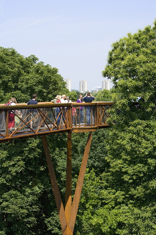
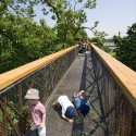
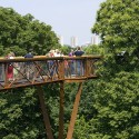
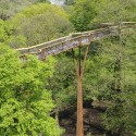
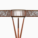
From the architect. Kew Garden’s Tree Top Walkway opened on 24th May 2008, Kew’s Year of the Tree, to over 9,000 visitors. The Walkway is a thrilling experience, taking visitors 18m high into the tree canopies for a birds-eye view of Kew, providing insights into the special role of trees in our breathing planet and the intimate views of a deciduous woodland and its inhabitants from within the tranquillity of the leaves. Inspiration for the walkway was drawn from the ancient Fibonacci sequence found repeatedly in nature.

In conjunction with the Walkway, an underground ‘Rhizotron’ exhibition space is attached and which explores various themes associated with tree root biology, climate change and the relationship between tree roots and microorganisms. Its appearance is inspired by a natural cracking within the earth to reveal a dark and dynamic space rich with exciting and educational content.

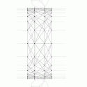
Marks Barfield Architects designed the walkway to be a visually light, discreet presence, at ease in its natural surroundings; while at the same time being unashamedly man-made. They decided to integrate the structure with the handrail support and drew on the Fibonacci sequence, which underlies many growth patterns in nature. By using the progressive series of numbers associated with the sequence (1,1,2,3,5,8,13,21,34, etc), we were able to work to create a ‘Fibonacci grid’ along a typical walkway truss, resulting in a higher density of elements near the trussends where the vertical loads are highest.

A major challenge was to strike a balance between enabling visitors to get as close as possible to the tree canopies and being mindful of the complex tree root system below ground. A radar survey was undertaken to understand the extent of tree root activity at the proposed pylon and pile foundation locations. This enabled strategic positioning of the 12-18m long concrete piles between the major roots ensuring safety and longevity for the tress and walkway.

Kew Tree Top Walkway & Rhizotron  / Marks Barfield Architects © Peter Durant
Kew Tree Top Walkway & Rhizotron  / Marks Barfield Architects Courtesy of Marks Barfield Architects
Kew Tree Top Walkway & Rhizotron  / Marks Barfield Architects © Peter Durant
Kew Tree Top Walkway & Rhizotron  / Marks Barfield Architects Courtesy of Marks Barfield Architects
Kew Tree Top Walkway & Rhizotron  / Marks Barfield Architects © Peter Durant
Kew Tree Top Walkway & Rhizotron  / Marks Barfield Architects Site Plan
Kew Tree Top Walkway & Rhizotron  / Marks Barfield Architects East Elevation
Kew Tree Top Walkway & Rhizotron  / Marks Barfield Architects Detail
Kew Tree Top Walkway & Rhizotron  / Marks Barfield Architects Rendering 1
Kew Tree Top Walkway & Rhizotron  / Marks Barfield Architects Rendering 2

[ccw-atrib-link]

Pak Loh Times Square Restaurant / NC Design & Architecture

Architects: NC Design & Architecture
Location: Times Square Car Park, Causeway Bay,
Area: 6,000 sqft
Photographs: Nathaniel McMahon

Interior Design: NC Design & Architecture
Design Team: Nelson Chow, Chris Lam, Yazh Yip, Pierre Wu
Furniture Designer: Bridge Lam
Contractor: Kin Wah Decoration Limited
Custom Lighting Supplier: Ricardo Lighting Limited

From the architect. Prominently located on the 10th floor of the Times Square Shopping Center in Causeway Bay, Hong Kong, Pak Loh Chiu Chow Restaurant by NCDA is the latest addition to the multi-outpost Family owned Restaurant Group. Established in 1967, Pak Loh is locally renowned for its traditional Chiu Chow cuisine, which originates from the coastal region of Guangdong Province. To cater to the evolving tastes of the newest generation of Hong Kong diners, Pak Loh’s mission is to bring new elements to popular conventional dishes using innovative techniques and premium seasonal ingredients. As a design strategy, NCDA interpreted the mission statement and created a 6000 SF restaurant that represents the convergence of the old and the new through a synthesis of vintage references and streamlined modern details.

Arriving at the restaurant, diners pass through a curved passageway comprised of faceted brass vertical screens which leads to the main wood covered dining room. Placed on either side of the entrance, two curvilinear VIP rooms allow for a gradual passage from the bustling mall into the cocoon like wood interior of the main dining space.  The compressed entryway accentuates the generous volume of the main dining room beyond, and in turn the transition provides a calm yet discreet experience for the patrons as they enter and leave the restaurant. 

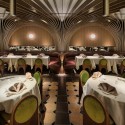
Dominating the main dining room, the vaulted walnut veneer ceiling structure references the spirit of 1960’s Hong Kong in a futuristic cutting-edge manner. The ribbed CNC milled ceiling structure consists of 20 half arches, which are rotated and repeated at angular increments to cover the entire ceiling. The ceiling geometry results in a cost effective and relatively simple installation that yields a unique and complex form.  The wood clad structure offers good sound absorption properties which helps to reduce noise level in an otherwise loud space.  Bespoke wall sconces and suspended light fixtures are being placed strategically to create a rythmical pattern that further highlights the delicate framework of the ribbed structure. 

While the vaulted structure of the main dining room appears airy and larger than life, attention to small details and materials offer a comfortable and intimate scale at each of the dining zones.  For instance, custom upholstered burgundy leather banquettes with horizontal mirrors and 60’s geometric print wallpaper define individual table groupings. Furthermore, custom olive green velour chairs with curved legs are design to echo the vaulted ceiling and to break the scale of the space down to more intimate components.

Efficiently located at the back of the restaurant, the bathroom is divided into male and female halves using a large central communal sink. Custom backlit male and female WC indicators are placed above each door in the manner of an aircraft installation, and leads the patrons to the corresponding toilet compartment where each one is cladded with a distinct color tiles.

In the design of Pak Loh, NCDA sought to avoid any direct links to the Chinese vernacular, while mixing modern and classic materials to create a comfortable and refined dining space that respects the 60’s Hong Kong manner of dining. Pah Lok Chiu Chow Restaurant showcases a holistic approach to restaurant design, seamlessly integrating the interior design, furniture, lighting fixtures, graphics, and staff uniforms. By defining an aesthetic from the mood and lighting of a space right down to its detailed ceiling construction, the end result is a visually striking yet highly functional contemporary restaurant.

Pak Loh Times Square Restaurant / NC Design & Architecture © Nathaniel McMahon

[ccw-atrib-link]

BIG & small House by Anonymous Architects

Anonymous Architects have designed the BIG & small House in Los Angeles, California.

bs_090114_10

bs_090114_11

bs_090114_12

bs_090114_20

bs_090114_21

Project description

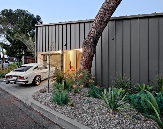
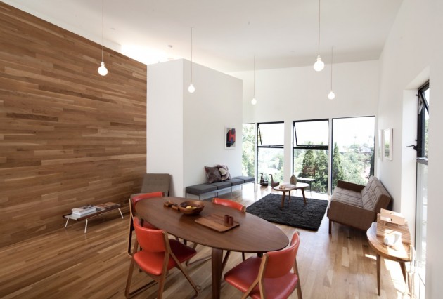
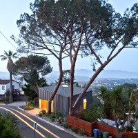
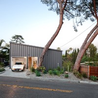
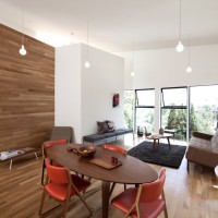
Starting with a vacant lot that was half of the typical minimum lot size, the objective was to compensate for the relatively small footprint of the house.

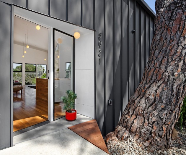
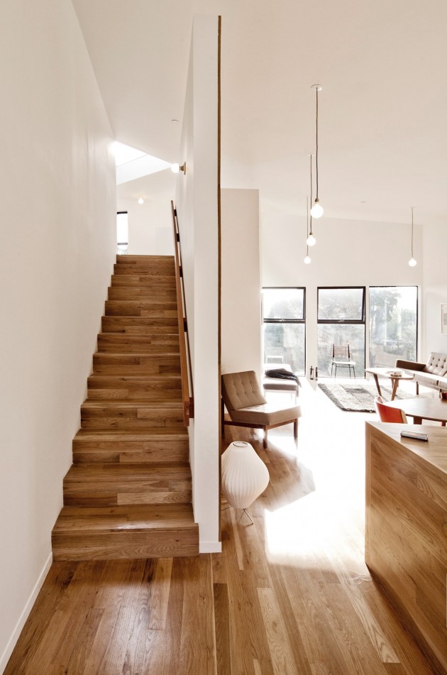
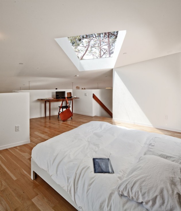
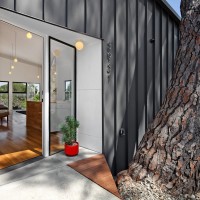
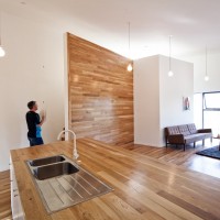
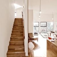
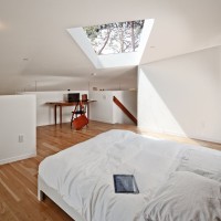
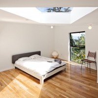
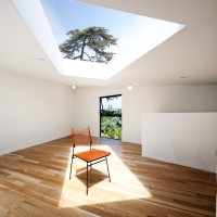
To achieve this there are only 2 full height walls inside the house which makes the main interior room nearly as large as the building footprint. This gives the house an open lofted feeling with very high ceilings and abundant natural light.

It is an inversion of expectation, so that the smallest house contains the largest room. What the house lacks in square footage it provides in volume.

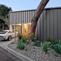
The free plan of the vacant lot is preserved since the house touches the ground only at the four small piles, giving full access to use the space between the house and the lot. The footprint of the foundation is in fact less than 20 sq.ft. and the house doesn’t touch the ground at any point.

The plan of the house follows the shape of the site which is an asymmetric parallelogram. This form resulted in unusual geometry inside and outside the dwelling and explains the shape of the house. The elevations of the house are designed to mirror the plan.

bs_090114_01
bs_090114_02
bs_090114_07
bs_090114_10
bs_090114_11
bs_090114_12
bs_090114_18
bs_090114_20
bs_090114_21
bs_090114_22
bs_090114_23
bs_090114_24
bs_090114_25
bs_090114_26
bs_090114_27

Architect: Anonymous
Photography: Steve King

[ccw-atrib-link]

SM’1 House / SUN Architects & Engineers

Architects: SUN Architects & Engineers
Location: , Jeju-do, South Korea
Architect In Charge: Eunsoo Sun, Seungjong Kang
Area: 243 sqm
Year: 2012
Photographs: Seunghoon Yum, Eunsoo Sun

From the architect. SM’1 House is the house of the architect who has his wife and two daughters. Everyone who constructs wants to build his house but it’s said to be difficult to do such a thing easily. The excuse that architects have not established their construction world, vague fear and hesitation seem to make them feel a heavy burden.

I had been in such trouble and delayed it, during thinking ‘I have to do something as an architect and a father’ for the closest people called ‘Family’, I watched a father’s story on the media accidentally and the story haunted me. It’s said that the house is a place where children’s value memories are and makes them keep their memories of childhood a lot.

However, most people build their house tremendously for a couple after children grew up and leave their parents. I blamed myself for ‘ Are there spatial sympathy of family during living the apartment for dozens of years? How often do we communicate with each other? in that space”. During I was thinking about these questions, I liked to build a house as soon as possible and then I put the thought in practice. At home, I don’t know how long I live in the house but I want to dream beautiful memories and the happiness of my family.

Ora 3-dong, Jeju-si, Jeju Special Self-Governing Province is located around the existing settlements that is in the old town(Juju-si) in current Juju and in the center of New Jeju. Around it, houses and villas, warehouses, etc are in the village so they make people feel a bit messy. The site is land which gives a cozy and comfortable feeling due to being well-lighted having a full south aspect. To the south, there is Hallasan(Mt), to the north, there are the airport and the offing so it has nice view.

The main concept of the deployment plan is if possible, to direct the space with different feelings by setting the relationship of the outer space in each room respectively. The space divided into this is planned to hold features of Jeju’s traditional house deployment, several small yards and a front yard have appropriate hierarchy in the yard and try to communicate organically each other. In addition, the feeling of the yard is a lyrical space where I saw in the grandmother’s house in the childhood, and the same concept in lighting plan to direct was applied and planned.

The main room (large Kudul), kitchen (Jeongji), guest and tea room (Barkgeori), hobby room, utility room (Gopang) are planned focusing on the living room (Sangbang) on the first floor, it’s planned that the living room is in the center of the house and family members can get together, the living room always gives bright and spacious feeling by placing my housewife’s flow and eyes openly with opening it with the kitchen.

In particular, I made both the front yard and inside-back yard come to indoor. In the guest room, Pongnang yard emphasizes lyricism to remind people of neat Jeju stones and Pongnang on the past ollegil.

The facade reflected on the form of flat arranged as the three-dimension moderated decorations as much as possible to emphasize neat feeling. Neat and clean white stucco and glass has the intention not to disturb surroundings by embracing natural colors.

SM'1 House / SUN Architects & Engineers © Seunghoon Yum
SM'1 House / SUN Architects & Engineers © Eunsoo Sun
SM'1 House / SUN Architects & Engineers © Seunghoon Yum
SM'1 House / SUN Architects & Engineers © Eunsoo Sun
SM'1 House / SUN Architects & Engineers © Seunghoon Yum
SM'1 House / SUN Architects & Engineers © Eunsoo Sun
SM'1 House / SUN Architects & Engineers © Seunghoon Yum
SM'1 House / SUN Architects & Engineers Site Plan
SM'1 House / SUN Architects & Engineers First Floor Plan
SM'1 House / SUN Architects & Engineers Second Floor Plan
SM'1 House / SUN Architects & Engineers Elevation 1
SM'1 House / SUN Architects & Engineers Elevation 2, Section 1
SM'1 House / SUN Architects & Engineers Elevation 3, Section 2
SM'1 House / SUN Architects & Engineers Elevation 4
SM'1 House / SUN Architects & Engineers Diagram 1
SM'1 House / SUN Architects & Engineers Diagram 2

[ccw-atrib-link]

Herzog & de Meuron Design for London’s Canary Wharf Towers Revealed

British architects Allies and Morrison have submitted their planning applications for the 22-acre mixed-use development for London’s Canary Wharf. Swiss firm Herzog & de Meuron has designed a 56-story tower that will account for some of the 3,100 residential units planned for the project. London-based Stanton-Williams is responsible for the other two apartment buildings to be […]

[ccw-atrib-link]

The Gabriel Chandelier by Ronan & Erwan Bouroullec

Ronan & Erwan Bouroullec have designed the Gabriel Chandelier, the first permanent contemporary piece installed in the Palace of Versailles, France.

Description

The Gabriel Chandelier, which is over 12 meters high and weighs half a tonne, is composed of 800 crystal modules. These pieces are threaded around a stainless steel skeleton containing a led lighting system. Realized by Swarovski.

gc_191113_01
gc_191113_02
gc_191113_03
gc_191113_04
gc_191113_05
gc_191113_06
gc_191113_07
gc_191113_08
gc_191113_09
gc_191113_10
gc_191113_11
gc_191113_12
gc_191113_13
gc_191113_14
gc_191113_15
gc_191113_16

Design: Ronan & Erwan Bouroullec

[ccw-atrib-link]

Cliff Hanger / Björn Gross & Josef Wideström

Architects: Arctic Studio
Location: , Sweden
Architects: Björn Gross, Josef Wideström
Area: 300 sqm
Year: 2010
Photographs: Krister Engström

From the architect. This house is situated on a steep slope by the lake Aspen near Gothenburg. The direction of the volume is adapted to the topography, while the diagonal ridge opens up the interior living space and the terrace towards the evening sun. This diagonal cut creates a dynamic shape in three dimensions, emphasized by the dramatic cantilever – the cliff hanger.

The 19×12 meter wooden box, covered with Siberian larch, is cut open in order to create exterior spaces inside the box and let light into the building. This wooden volume is then placed on a solid concrete foundation that solves the height difference and works as an extension of the cliff.

• Cantilever box
• Diagonal ridge
• Concrete/wood

Cliff Hanger / Björn Gross & Josef Wideström © Krister Engström
Cliff Hanger / Björn Gross & Josef Wideström First Floor Plan
Cliff Hanger / Björn Gross & Josef Wideström Ground Floor Plan
Cliff Hanger / Björn Gross & Josef Wideström Section
Cliff Hanger / Björn Gross & Josef Wideström North Facade
Cliff Hanger / Björn Gross & Josef Wideström West Facade
Cliff Hanger / Björn Gross & Josef Wideström South Facade
Cliff Hanger / Björn Gross & Josef Wideström East Facade

[ccw-atrib-link]

California House by InForm & Pleysier Perkins

InForm together with Pleysier Perkins have designed the California House, located in Brighton, a suburb of Melbourne, Australia.

Description

This modernist inspired architecture, with deep horizontal roof planes, extensive glazing and emphasis on outdoor living is perfectly suited to the Australian lifestyle and climate.

The California house maximises the potential of its corner site with all living spaces orientated towards north facing gardens. The upper floor accommodates a master domain and three other bedrooms, separated by the stair well.

Stained western red cedar cladding contrasts with white fascias, tiled fireplaces and silver travertine that flows throughout the ground floor and external terrace.

ic_151113_02
ic_151113_03
ic_151113_04
ic_151113_05
ic_151113_01
ic_151113_06
ic_151113_07
ic_151113_08
ic_151113_09
ic_151113_10
ic_151113_11
ic_151113_12
ic_151113_13

Design: InForm and Pleysier Perkins
Photography: Rhiannon Slatter

[ccw-atrib-link]